Wednesday, October 27, 2010

Halloween Sour Cream Containers


Hi Everyone! I posted these instructions on my customer blog, but thought you all might like to see them too. :)

Here is how to make these fun and easy Halloween sour cream containers. Don't they look just like the shapeofthe containers of sour cream you get at Wendy's? :)

1. Start with a 4 1/4 x 5 1/2 piece of paper or cardstock.


2. Put adhesive on the two long sides and one short side. Now put the short sides together to create a tube, just enough so that the adhesive overlaps the other side.


3. Now close one end together (your adhesive is already on the inside of the paper so you are all set!)


4. For an extra touch, you can crimp the end you just glued together, crimping about 1/2 to 1 inch. It's just a cute little touch to add, but totally optional so don't worry about it if you do not have a crimper handy.


5. Fill with candy and treats (Yum!). Now repeat steps 3 and 4, but this time, close the tube at 90 degrees from the other end. So, one end will close one direction, and the second end will close another direction, as shown in the photo.


6. Last of all, punch a small hole in one end and tie on a cute tag. That's it! You can make these in less than 3-5 minutes so they are perfect for making for party favors etc! Have fun!

Monday, October 11, 2010

Halloween Goodies


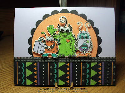
Thought you might like to see a few Halloween goodie ideas that I've played with! I never give out Halloween cards, but treats...now that's a fun thing to do with Halloween papers and stamps! The coffin treat boxes uses the September stamp of the month and the rest uses the Hooligans WOTG kit. And check out the monster tag on the sour cream container...I used a google eye...inspired by Kim Lundstrom...thanks Kim! :)

To get the template for the coffin boxes go to:
http://www.marthastewart.com/article/coffin-treat-box. I got the idea for these coffin boxes from Jess Ballas. Note...the skull has one of the sparkles on his eye...kind of fun!
Enjoy!

Friday, October 8, 2010

Aren't they cute!?! Supply list and a couple other cards on my blog at kimlundstrom.blogspot.com

Tuesday, October 5, 2010

Take the Poll!

Hey Everyone!
Our team blog has a new poll on it! Come play and take the poll at: heartfeltstampers.blogspot.com. :)

Hugs,
Tracy

Studio J


I am so loving Studio J! I can't even tell you how much! It's so stinkin' easy and the layouts look great. You know I went to make a traditional layout for an expo I was doing and uploaded a print to Walmart to have printed as a 5x7. It cost me $2.85!! Just for that picture! And with a Studio J membership I'm only paying $3.25 per page...plus I get a free sheet protector and free shipping. :) So if I were to duplicate that same page the traditional way, just the background piece of cardstock would cost the 40 cents difference between 2.85 and $3.25! Not to mention any other papers, embellishments etc. What a steal! When I show my customers the cost effectiveness they light up! If you haven't played with Studio J, you totally need to try it and show it off to your customers! :)


This is one of the 4 new cards I put on my blog this morning. If you would like to see the others and get a list of supplies to make this cards you can find it at http://kimlundstrom.blogspot.com/

Tuesday, September 21, 2010

Card Ideas on My Blog

I have uploaded some CTMH cards to my blog if anyone wants to have a look it's at kimlundstrom.blogspot.com

Monday, August 23, 2010

Looking for WOTG brochures

Hey Everyone! Kim Reeves is looking for an extra WOTG brochure for the Hooligans kit and the Magnifique kit. If you have one that you could spare could you email her at: kreeves@aph.org.

You guys are awesome!
SMiles,
Tracy

Tuesday, August 3, 2010

Triple play sets

Hi ladies,

Ok, so I have had the Triple Play set for about a week and I cannot fathom out how to fix the books together. Does anyone understand the instructions? I'm certain I am being an idiot but if someone could post step by step instructions I would be eternally grateful. Then perhaps I can use a completed book to show any customers that decide to show up.

Cheers
Ann-Marie

Monday, July 19, 2010

Convention Picts!


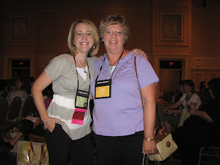
Convention at the Gaylord hotel. Loved the window clings and decorations up everywhere! Me, Jen, Kim L. and Tammy.


Jon Schmidt was the entertainment at the awards night. It was amazing! Look him up on Youtube if you want to get a feel for what he is like. So talented!


Here are a few pictures from convention! Woohoo!!! This is a picture of children who were benefited by Close to My Heart's donations to Operation Smile. It made me cry!


Kim Reeves and I. This lucky gal won some free product during the game show! You go girl!


Tammy, Kim, and Linda at Extravaganza. LOVED the classes and free product they gave us at each booth!


Cheryl getting recognized for being with Close to My Heart for 10 years!! Woohoo!!! Cheryl, you rock!


Unit dinner at "Ketchup"...a local restaurant. Hmmm...I don't think any of us actually ate any ketchup! LOL!

If any of you have pictures to share as well, please post them on the blog. It would be so fun to see them! :)

Smiles,
Tracy

Convention Wrap Up!

Hi Everyone!
Convention was awesome!!! I can't believe the way it just flew by! I had to leave a little early to get home for my daughter's 16th birthday and then we turned around the next day and went out of town for a family vacation for 6 days! So I am just now getting home and getting a chance to sit down and process all of the exciting info and cool news from convention!

Here is a re-cap of all the good news from convention! It was mostly put together by my friend Janene, but I made some tweaks and notes that pertain to our team. :) It's long so you may want to print it out! LOL!

Happy stampin' and scrappin'!
Tracy

NEW IDEA BOOK! The new Autumn/Winter idea book is live for consultants on August 1st, but not live for our customers until September 1st.

Our Idea Book is changing! We will no longer have an Idea Book three times annually, but are moving to twice annually instead, with an extra 24 pages (if I remember right) being added to each idea book. They are doing it for a few reasons - ease in product release with the convention year, and the ability to decrease cost for all of us (which is awesome!). Jeanette Lynton, founder and CEO, was excited to share that with all of the scrapbook companies and stores that have had to close their doors, go bankrupt, or overhaul their companies - CTMH is and always has been strong, and we are currently debt-free and in a great place of strength. BIG CHEERS! Doesn't it feel good to work for such a solid company that we know isn't going anywhere? I love my job! Anyway - we will now have a Spring/Summer edition that will run from February - July, and an Autumn/Winter edition that will run from August - January. The current idea book is the final edition of the current schedule, so the next edition coming up will be the Spring/Summer edition on Feb. 1st that will run for six months. If you notice, the new idea book runs from Sept. - Dec., and the next one starts in February. So what about the gap this January as we transition? Kristine Widtfeldt said we will have some transitional item - it would be a special publication for the month highlighting National Papercrafting Month and our special, would include the SOM, etc. So that will be a fun thing to watch for!

IDEA BOOK PRE-ORDER: On that note, there is a new pre-order program for Idea Books. Consultants can now pre-order and pre-pay for their idea books, and there is even more flexibility at a great price. You can pre-order in packs of 10, 25, 50, or 100, and regardless of which size pack you order, they are all the same price of $1.25 each. YAY! You no longer need to buy from other people if you don’t want to. Pre-orders for the Spring/Summer 2011 Idea Book can be placed beginning soon (look for a corporate update) through October 31, 2010. For the 2011 Autumn/Winter Idea Book, pre-orders are accepted January 1 to April 30, 2011.

NEW COMMISSION CARD! Beginning October 1, 2010, Close To My Heart commission checks are replaced by a commission payment card. Commissions earned during the month are deposited on or around the 15th of the following month. This will act as a debit card - your commissions can go right on this card for immediate use. The same timeline applies as it does now - funds available around the 15th of the following month, for the previous month's sales. So, I would be paid November 15th for my October sales. This does NOT replace the current direct-deposit system that CTMH has set up and consultants currently on direct-deposit will remain that way unless they ask to switch. What it DOES replace is the mailed commission check - less work and money for them, and faster for you.

JCCU PROGRAM RETIRED: CTMH is retiring the JCCU consultant level. JCCU (Junior Consultant with Corporate Upline) will end as of December 31, 2010. Anyone at this level will no longer be part of CTMH, and will return to being a customer with no consultant contract. If you ARE at this level and would like to stay with CTMH, you can sign up again as a consultant and start fresh with an immediate 22% discount by purchasing a new kit. Or, you can place $300 in orders for two consecutive quarters and you will become active and not have to purchase a new kit. If not, after Dec. 31st they will go back to being a customer.


Junior Consultants: This status will continue to stay the same. A consultant is JR when they do not place the minimum $300 per quarter. To remain a JUNIOR consultant you must place an order of any size at least once during the calendar year. Jr. Consultants receive a 10% discount. By submitting $300 within any calendar quarter, you will automatically move back to active status and get your 22% discount/commission back...easy! Be thinking about your status, as consultants will be able to order from the new Autumn/Winter idea book on August 1st, and your personal orders DO count toward reaching that $300.

SOME OF THE NEW PRODUCTS!
There are 8 NEW colors that are part of our Summer Palettes! Woohooo!!! I was not a fan of our summer palettes so I’m way excited!

The Summer Carnival Palette is now Gypsy, Holiday Red, Pacifica, Sunny Yellow, Sunset, Topiary

The Summer Celebration Palette is now Cotton Candy, Dutch Blue, Lagoon, Pear, Sky, Smoothie.

This means the colors being retired are: Hydrangea, Ocean, Orange, Star Spangled Blue, Clover Meadow, Watermelon, Bubblegum, Citrus Leaf. Stock up on supplies now for any of these items you want to keep for your own personal stash.

Brand New Albums that are now FAUX LEATHER and come in 6 colors: Black, Dark Chocolate, Dark Cranberry, Dark New England Ivy, Hollyhock, and Outdoor Denim

This means, all of our current albums will be retired - no linen and no expensive leather. They are NOT in the new catalog. NO 6x6 albums and no 9x9 albums. The new albums are gorgeous and a wonderful price of just $24.95.

My favorite new product: BIG Flip-Flaps for scrapbooking! We have the small 4x6 size to add to our protectors for more photo room, and now we have BIG ones to extend the size of our pages. These will be best-sellers, for sure!! We now have a 12" Assortment of the flip flaps (4x12, 6x12, 8x12)! So you can add to the top, bottom, and/or sides of your pages to increase the amount of room and pictures that you can scrap. LOVE THESE!

Magic is the newest addition to our hard-bound how-to books. This new "how to" book featuring cleaver Interactive techniques for scrap booking! This will also be a big hit and a huge seller! Another favorite product...

Some of the new embellishments include sparkles in colors, pearls and shimmer brads! There are a bunch of new stamps and a cute My Creations Album called Mix and Mingle!

STUDIO J: Studio J will now have expanded color choices, more patterns, and new photo editing tools!!! WOO HOO!!!

Coming Soon: Studio J will have Memberships to sell with GREAT Benefits:
1) Hostesses get credit for membership sales
2) Customers earn campaign rewards
Under the Membership Studio J Members will save 50% on layouts...That is $6.50 per 2-page layout and $5.07 for the consultant price (Just $3.25/$2.54 per page!!!) AWESOME!!!!! Members also get high resolution digital files for printing and archiving and low resolution for E-mailing and online sharing. You can even just purchase the digital files for only $3!!! Great for those who want to print their own!

But wait there are more options!!! There is a discounted 5-Pack that is great for gifting and good as an ideal "Try Me". There is a page in our idea book that covers all of these features, clearly explaining the benefits to our customers.

New Studio J "App" for the I-Phone or I-Touch! I don't believe there was an official release date, but I think it was coming in the next few weeks. Basically, you'll be able to access Studio J on one of these two devices, so that it's portable at your gatherings. You can show how it works, and you'll even be able to access your own layouts created with Studio J. No more trying to just 'talk' about it - you can show it!


New Constant Campaign for July-August
Consultants only! When you sign up for a website you will get a Studio J membership for FREE! Dates: July 15-August 15, 2010. Purchase a 12-month membership (or extend your current membership 1 year) and you will get a free 12-month membership to Studio J (savings of $99!). The activation fee for your website is also waived. This is a MUST-DO for all consultants and such a steal. The math adds up to only about $8.25/monthly and is an awesome annual price!

New Consultant Kit on August 1st! $129.00 - WOW! The New Consultant Kit provides all of the basic business essentials (order forms, catalogs, invitations, etc.), PLUS they get to choose 3 "Choose Me" bundles to include (6 to choose from), and can even purchase the remaining three bundles for just $40 each if they'd like. This gives consultants the ability to customize their kit however they'd like. Here are the six bundles coming up (remember, new consultants can choose 3 of these included in their $129 price). Tier 2 MyCTMH website; 12-month Studio J membership; 'Magnifique' products plus stamps, inks, accessories; 'Mistletoe' products plus stamps, ink, accessories; Shoulder tote, album, expanders, label holders, etc.; Stamps, blocks, and a my Acrylix stamp set organizer. So awesome!!

If a new Consultant wants them all, they can purchase them all! Each additional "choose me" option is only $40. Close To My Heart provides a new Consultant a super value with the New Consultant Kit. A new Consultant can receive a kit that is two to three times the value of the price.

Workshops on the Go: Simplified - no more 'best' option, just the $29.95 basic kit. This gives consultants the flexibility to promote this however it works best for your customers, suggest items for additional purchase, etc. Very cool thing is that all of the WOTG kits will now be featured in the catalog so your customers can order them on any kind of order, plus see in advance (including the stamp set) so that they can plan ahead. Very cool! The Autumn/Winter issue has a 2-page spread devoted to "Workshops on the Go" so that ANYONE can purchase all of the featured kits and see what comes in each, including the stamp set, paper, embellishment, and see the layout in color. HELPFUL!

FREE CREDIT CARD PROCESSING! EVERY CONSULTANT CAN ACCEPT CREDIT CARDS FOR FREE! YES, I said FREE! That means that when a customer wants to pay with a credit card, all consultants can accept this, even if you don't have a current 'Propay' account! There will be a place in the Order Entry section where you can choose to continue paying the full amount with your own card, or you can enter each customers credit card directly. AND there are no fees associated with it either. If you have a website and your customers place an online order, you are no longer charged processing fees. Basically - it's less work and more money for us. Thank you, CTMH! You will receive your commission from any customer credit card order tacked onto your commission check on the 15th of each month. Yay!

Constant Campaign for National Stamping Month is the 'Triple Play' (Mini-Album Kit)
Preview: July 15 - August 14th
To Customers: August 15 - September 30
Buy It Full Price: $29.95
Earn Your Discount:
Purchase Minimum Stamps $25 = just $15
Purchase Minimum Stamps $40 = just $5
Hostesses and New Consultants = FREE*
This kit includes all the supplies needed to make some super cute mini albums, including mini-stamp pads, paper, accessories, and an instruction guide. Be watching online in the 'Constant Campaigns' section for a flyer and more details.

NEW HOSTESS REWARDS ADDITION: Hostesses can now start receiving a half-price item at the $250 level instead of just $350!! WOO HOO!!!

EZ-INVITE: Beginning October 1 EZ-Invite will no longer require a face to face gathering for the hostess to receive product credit. You must have at least 2 people minimum who order from the website and sales must be of at least $150 for it to count! WOO HOO!!!! This means that you can host parties ANYWHERE - basically, we now offer book/catalog parties or online/web parties. A great way to increase your sales when you can set up an EZ-Invite for people out of state, they can invite people to shop from your website, and then you'll help your hostess choose gifts and close the show. AWESOME!!

INCENTIVE TRIP: The next Cruise/Incentive trip destination for 2012 is HAWAII!!!!! I plan on being there.. who's coming with me? This contest begins October 1st, so start working on your plans to step up your business and earn the points to get there!

2011 CONVENTION: Mark your calendars now for July 14-16, 2011!!! Convention will be held in Anaheim, California at the DISNEYLAND HOTEL. There is a "Dollars to Disney" program so that you can pay small amounts monthly and have your registration paid before convention even hits. SO NICE for the budget, and it begins August 3rd. And we already know our color group for classes! Our team will be Sleeping Beauty (pink). If that color group fills up, use Cinderella (blue). Hmmm….I’m starting to dream up some fun pink things we can use for convention! LOL!

FREQUENTLY ASKED QUESTIONS: ALL of the FAQs for the new updates are on the Corporate Website under the "To Know" section - just click on "FAQs"!! There are a lot more details in each FAQ guide than what was shared here, so do take some time to check that section of the website out if you have additional questions that aren't answered here. THANKS, FRIENDS!! :D

Monday, July 12, 2010

Too much to catch up on ;o)

So in the list of the many pages I have to catch up on is the stuff relating to the upgrade of the front yard. We procrastinated a long time before getting to this. David's brain surgery and subsequent week long stay in hospital was the perfect time, although those helping didn't get in touch to deal with it fast enough, so it wasn't complete when he got home. That was very disappointing to me.

Anyway, I used the August 2010 stamp of the month "Something Splendid" for the flowers and leaves, "Cherished Flourishes" for the vines, Goldrush and Topiary inks, and the Splendor bulk papers as well as Colonial white for the background papers. I used colonial white and chocolate brads and a couple of unknown source picture holders. This was Imagine: Thumbnails. Well, I like it. That's all that matters.

Thursday, July 8, 2010

All the Scrapbook Ladies!

This is one of the many reasons why we love convention! The corporate staff is so fun! Check out this video!

Thursday, May 20, 2010


These are some pages I put together using Boom-Di-Ada. The first page seem to take me a couple hours but the rest went together about as fast as I could slap on the adhesive. That's why I hate to stop scrapping once I get started. The longer you do it the more momentum gain. My husband and 16 year old son are going to the cabin this weekend. My 19 year old daughter and I will be at home so I think I may have to scrap and stamp all weekend! Yeah!!
Thanks for looking!
Kim Lundstrom
Marine on St Croix, MN

Friday, May 7, 2010

PH.D!!! Woohoo!!

I'm so excited because this morning I finished my Ph.D in Close to My Heart's Training Academy!!! Woohoo!!! It was so easy and a ton of fun. I often played the classes on my computer in my kitchen while I did dishes or cleaned up and that made it so easy to squeeze it in. :) And the classes are not long so that makes it fabulous! And check this out...they even have a little blog badge that you can put on your blogs when you have your PhD! Fun! You can see it on my blog at: www.tracyscraftroom.blogspot.com if you want to see what it looks like! (BTW, I also have the Studio J blog badge on there if you want to see that too! It's a fun little way to promote Studio J!).

Who else on the team has finished a degree with the Training Academy? Post a comment here on the team blog to let me know and I'll mail you a little congratulations gift! :)

Smiles,
Tracy

Wednesday, April 28, 2010

A couple of new layouts

I did a new layout over the weekend. I hope that you like it. I also added photos to some of the previous layouts I did with the Spring and Summer papers. So the first layout I added photos to was with the Zippidee papers.


The next layout was with the Splendor papers. I like these papers very much and I only have the bulk paper pack to work with at this point. This one worked quite well with some of the Back Country My Stickease.


The next layout I put photos onto was the Veranda papers. This one was fun but became a bit tricky when I realized I had chosen and printed my big photo in portrait instead of landscape. The original layout required a landscape photo, so I had to improvise.  Oh well, I think it turned out ok.


I added photos to the You Rock layout I did.


And finally I got round to purchasing a Studio J layout I did for my son's birthday party. It was such a fun layout that I couldn't resist. Studio J really is wonderful and I hope my business picks up in order for me to utilize it. Happy days, everyone. Best wishes from Ann-Marie.

Saturday, April 17, 2010

Passages - from Ann-Marie


Ann-Marie writes:
Here is the layout I decided on, using the Passages bulk paper packet. Running low on the CTMH colored card stock is rather annoying. However, this paper packet is very versatile and easy to use. I did the layout from Cherish entitled Pleasing Paradigm. I felt that the color combination for the papers warranted no color in the photos, so I chose to use some old black and white family photos. I used green garden eyelets, green card card stock, green garden ink, barn red card stock and some My Stickease leaves from the Bella collection. I also used a word label from the Bella collection and used barn red to outline the flowers, that were actually the wrong color. The flowers I used were Bitty Blossoms from the Imaginesce collection purchased at KMA locally. The green flowers I used were too bright so I used garden green ink with a sponge dauber to change their color. Hope you like it. It took me most of today to do.

Cherry-O Layout - from Ann-Marie


Here's another layout from Ann-Marie. She writes:

This is the layout I chose for the Cherry-O papers. It uses two B&Ts from the bulk paper packet together with Crystal blue and Chocolate colored card stock. On here I used three different Connections Club reward items, one was the pearls, one was the latest reward available: the textured stickers that resemble the Cherry-O paper and the last was the old rhinestone frames. The layout is again from Imagine and is entitled Introduction.

Zippidee - From Ann-Marie


Here's some artwork from Ann-Marie. She writes:

So here's the first layout I did. I don't have enough Cranberry or Indian corn blue card stock to make good use of this paper pack right now. I will do another layout when I have more. This layout is from the Imagine book and is entitled "Thumbnails". I have used Indian corn blue eyelets, chocolate ribbon, Indian corn blue, Desert Sand and Colonial White card stocks and the two designs for the Zippidee bulk paper packet.

Thanks so much for sharing Ann-Marie!

Thursday, April 1, 2010

Studio J - Day 14


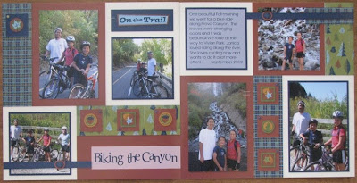
Promise you won't look at me on the bike in this layout! Ha! Ha! Ha! I usually much prefer being behind the camera! :) Anyway, the tip with this layout is rotating features. Remember that you can rotate any accessories you want when you play with Studio J....stickease, staples, buttons...anything! Just click on the object and you will see a circular arrow in one corner. Just click on it and turn it until it is in it's desired position. See the leaf stickease in the top left corner of the left page. I played with the angle of the leaf until I had it where I liked it. So easy! You can also turn the staples and cross them to make an "X" shape. I love doing that with staples!

Monday, March 29, 2010

Studio J - Day 13

This is another layout where I created my own title area by adding a stickease tag and then a new journaling box on top. But the tip with this layout is a little note that you should feel free to play with the default embellishments. Each layout has default ribbon, brads, buttons etc that are "recommended." But don't feel like you have to use them! Just click on the embellishment and then the little trash can picture to delete it. Instead of the brads, add a stickease. Or instead of buttons, add knots of ribbon. There are so many choices. The default options are just a guide for someone who is starting out or if you just want to do something fast and easy. So feel free to be creative!

Friday, March 26, 2010

Studio J - Day 12


This layout was a really fun one to make and it came together really easily! See the "Girl Time" accent piece on the left page? It is decked out in Stickease! :) Stickease alphabet letters, medium size Stickease (with a digital brad in the center of the flower...don't forget to play around with adding the buttons and metal embellishments to the stickers!) and the Stickease borders. Here is how I adjusted the borders stickers. When you drag a border sticker to the layout, it will automatically make it 12 inches long to match the page. To re-size it, just click on it after you drop it on. Grab the diagonal arrow in the bottom right corner of the sticker and just move it until it is the size you want! That changes the whole proportions of the sticker, adjust the size both in length and width. If you want to just shorten or lengthen (and not change the other dimension, just grab one of the box icons on one of the sides and move it to fit. Play with it and you'll see what I mean. It's so easy! And it's nice because you can't resize the real stickease!

Thursday, March 25, 2010

Studio J - Day 11


This layout is originally designed to be rotated, but I wanted my two focal point photos to be horizontal. To rotate your layouts, all you have to do is click on the gray circular arrow in the top corners and it will flip that page. Click once to turn the page 90 degrees, twice to turn it 180 degrees etc. It's fun to make whole new layout looks! Play around with rotating only one page, or rotating one page 90 degrees and the other 180 degrees....you get the idea. There are many possibilities and each one makes it look like a totally different layout!

Wednesday, March 24, 2010

Studio J - Day 10

Not recognize this paper? Well, SURPRISE! Studio J offers an exclusive kit every few months that is not offered in the Idea Book! These kits will be theme specific (love the Halloween theme...something not offered in the idea book but that people often want to use) and will include exclusive stickease that go with it! It's a fun little extra with Studio J!

Tuesday, March 23, 2010

Studio J - Day 9


I love how the Stickease look 3-D with shadows around them! It's awesome! You can see on this layout how I added them in the squares, purposely letting them be bigger than the square. It makes them look even more dimensional to me. :) I also purposely made the title "Pinewood Derby" go sideways...I like that look! Then in the journaling box you can see that the journaling goes around the stickease. I added the sticker first and then typed the journaling, just putting in a couple of hard returns to make it go around it. If you want you can also make the journaling go over elements like the stickease! Play with it and have fun! :)

Monday, March 22, 2010

Studio J - Day 8


Here's another layout! As you can see, I used this kit for several pages I made to remember our Fall trip to southern Utah. :) Take a peek at the top right corner. See the tag there? I added that stickease tag to fit the space. Then I wanted to journal on the tag so I added a new text box by clicking on the button in the bottom tool bar that says "New Text Area." I simply moved that text box so it was centered on the tag and presto! A new journaling area! It was easy!

Wednesday, March 17, 2010

Studio J - Day 7


It's Day 7 and another layout! Same theme and paper packet as last time. You can't tell on this small picture, but I added distressing to the cardstock pieces. And I found out a great tip through trial and error! When you add distressing (choose the ink color and then drag the type of distressing over to the cardstock area and it will distress all similar cardstocks for you) you can click on it and it brings up a little slider to make the distressing darker or lighter! I love it! I found that on the layouts I printed the lighter distressing didn't show up much, so now I turn it all the way up! It hasn't looked too dark yet...just right! :)

Tuesday, March 16, 2010

Studio J - Day 5&6

Oops! I forgot to post yesterday! What can I say...it was a Monday! LOL! So here are two layouts for today! This first layout was created with photos from a family trip in the fall. In the journaling block on the left, you can see that the journaling looks like it is typed on Desert Sand cardstock. All of the journaling areas and title areas will automatically come with "vellum" as the default. The vellum looks like a lighter shade of the cardstock beneath it or looks like a sheer layer over patterned paper (whichever applies to the layout design). But you do not need to keep it that way! Feel free to change the background! Any of the cardstock colors that match that kit are an option (no patterned paper...but when do we ever use patterned paper to type journaling on? Very rarely). To change from vellum to a different color of cardstock, just click on the area and in the box that pops up there will be a variety of color swatches to choose from. Play with them all and see the one you like best!


Now on this layout I added stickease and buttons in the circle across the top. I had to resize the flower stickease. To make sure they were all the same, I just dragged one flower sticker to the circle and played with it until I got it the size I wanted. Then I clicked on it and made a note of how enlarged it was (there is a box that will say 125% or whatever). Then with the others I just dragged over another one clicked on the box and typed in the enlargement number so it automatically became the same size as the others. No need to eyeball it! :)

Friday, March 12, 2010

Studio J - Day 4


Here is another layout where I mixed typed font and the kit alphabet stickease. :) This time I just typed what I wanted on the left side and then added the stickease on the right. Easy as pie! Have fun!

Thursday, March 11, 2010

Studio J - Day 3


The Studio J tip for the day is to swivel your text boxes. In this layout the title is vertical instead of horizontal. If you rotate a layout, just click on the text box and one of the little icons looks like an arrow turning. Just click on it and the text will rotate! It's so simple! In this layout I scattered the kit alphabet stickease to make more room and also to make it look random. So, play around with your text and stickease....it's so easy!

Wednesday, March 10, 2010

Studio J - Day 2


Here is your Studio J layout for the day! :) I have always loved this kit. The tip I wanted to share with you was with the title on the left page. I mixed both stickease and the typed fonts. It's really easy to do! Just type the written words in the title box. I manually added extra spaces between the words "Janica's" and "birthday." Just take a guess...you can always click on it and add more space (or less) as needed later. Then use the quick title tool to add the kit alphabet stickease in that same area. You can easily re-size them as needed and drag them to the right place in the title area. You're done! It's really easy and I love the look of mixing the alphabet stickease and typed font.

Tuesday, March 9, 2010

Studio J - Day 1


I made this Studio J layout because I wanted to take advantage of the LARGE photos! If I were to enlarge each of these photos to 8x10 it would have cost me easily at least $2-$3 for each photo just in developing costs! One of the cool perks about using Studio J! And the string of photos across the top of the left page two was fabulous because they were only 2 1/2 x 2 1/2 in size and it was a snap to scale my photos down to fit. So no matter whether you want your photos larger or smaller, Studio J makes it easy!

Excited about Studio J???

Excited about Studio J yet? Well, if you aren't, now is the time to get excited!!! We have until March 31st to take advantage of a fabulous preview time to play with Studio J and get a great discount on your layouts!

All consultants (even Junior consultants and JCCU's) can try out Studio J™ to create and order up to 10 two-page layouts at the discounted price of $9.95 US per layout with a special 22% immediate commission. That brings the final price to just $7.76 per layout! As an added bonus, JCs or JCCUs who purchase all 10 layouts by March 31 will be reactivated to full Consultant status! Normally, to reactivate, a Junior Consultant must place $300 or more in quarterly sales. With this offer, they can spend as little as $77.60.

To help get you excited I am going to post a new Studio J layout, with a little tip on how to use Studio J every day until now and the end of the month! I hope you love it! And PLEASE feel free to share your own layouts too! You can post them yourself (email me if you need access to the blog) or email me your layout and I can post it for you. (BTW, Yes, we can scan or take pictures of our printed Studio J layouts just like how you would with any traditional layout). You are going to LOVE Studio J!!!