Wednesday, April 28, 2010

A couple of new layouts

I did a new layout over the weekend. I hope that you like it. I also added photos to some of the previous layouts I did with the Spring and Summer papers. So the first layout I added photos to was with the Zippidee papers.


The next layout was with the Splendor papers. I like these papers very much and I only have the bulk paper pack to work with at this point. This one worked quite well with some of the Back Country My Stickease.


The next layout I put photos onto was the Veranda papers. This one was fun but became a bit tricky when I realized I had chosen and printed my big photo in portrait instead of landscape. The original layout required a landscape photo, so I had to improvise.  Oh well, I think it turned out ok.


I added photos to the You Rock layout I did.


And finally I got round to purchasing a Studio J layout I did for my son's birthday party. It was such a fun layout that I couldn't resist. Studio J really is wonderful and I hope my business picks up in order for me to utilize it. Happy days, everyone. Best wishes from Ann-Marie.

Saturday, April 17, 2010

Passages - from Ann-Marie


Ann-Marie writes:
Here is the layout I decided on, using the Passages bulk paper packet. Running low on the CTMH colored card stock is rather annoying. However, this paper packet is very versatile and easy to use. I did the layout from Cherish entitled Pleasing Paradigm. I felt that the color combination for the papers warranted no color in the photos, so I chose to use some old black and white family photos. I used green garden eyelets, green card card stock, green garden ink, barn red card stock and some My Stickease leaves from the Bella collection. I also used a word label from the Bella collection and used barn red to outline the flowers, that were actually the wrong color. The flowers I used were Bitty Blossoms from the Imaginesce collection purchased at KMA locally. The green flowers I used were too bright so I used garden green ink with a sponge dauber to change their color. Hope you like it. It took me most of today to do.

Cherry-O Layout - from Ann-Marie


Here's another layout from Ann-Marie. She writes:

This is the layout I chose for the Cherry-O papers. It uses two B&Ts from the bulk paper packet together with Crystal blue and Chocolate colored card stock. On here I used three different Connections Club reward items, one was the pearls, one was the latest reward available: the textured stickers that resemble the Cherry-O paper and the last was the old rhinestone frames. The layout is again from Imagine and is entitled Introduction.

Zippidee - From Ann-Marie


Here's some artwork from Ann-Marie. She writes:

So here's the first layout I did. I don't have enough Cranberry or Indian corn blue card stock to make good use of this paper pack right now. I will do another layout when I have more. This layout is from the Imagine book and is entitled "Thumbnails". I have used Indian corn blue eyelets, chocolate ribbon, Indian corn blue, Desert Sand and Colonial White card stocks and the two designs for the Zippidee bulk paper packet.

Thanks so much for sharing Ann-Marie!

Thursday, April 1, 2010

Studio J - Day 14


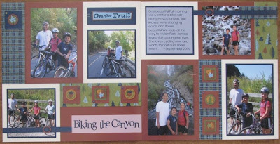
Promise you won't look at me on the bike in this layout! Ha! Ha! Ha! I usually much prefer being behind the camera! :) Anyway, the tip with this layout is rotating features. Remember that you can rotate any accessories you want when you play with Studio J....stickease, staples, buttons...anything! Just click on the object and you will see a circular arrow in one corner. Just click on it and turn it until it is in it's desired position. See the leaf stickease in the top left corner of the left page. I played with the angle of the leaf until I had it where I liked it. So easy! You can also turn the staples and cross them to make an "X" shape. I love doing that with staples!